While your product may be filled with gourmet ingredients and nuanced flavours, you need to ensure you’re communicating the quality of your offering through your item’s label design.
When browsing crowded shelves in grocery stores, shoppers will often base their purchasing decisions on the style of your packaging. If a customer is not familiar with your brand and has not tasted your products, your label may be the only information they have to weigh up in their decision-making process.
To attract customers with a pickier palate, or those who will be more likely to pay a higher price for a better-quality product, you need to create a food label that conveys the flavour your product provides.
For a little perspective, imagine you’re making your way through the confectionary aisle at your local store. It’s likely you’ll find a range of Cadbury and Lindt products occupying the same area, each with very different labelling styles.
Designed for broad appeal and mass consumption, Cadbury uses soft, shiny purple wrappers with fun, chunky graphics. Lindt, on the other hand, opts for a more pared back approach. Featuring a monochromatic design with gold foiling, it aims to engage consumers with more refined tastes who may prefer to only indulge on occasion.
With this contrast in mind, here are some of the factors you should take into consideration when designing a premium quality food label.
Label Design Elements
Everything you choose to include (and exclude) in your food label design will have an impact on how your product is portrayed to potential customers. By appropriately styling your label, you will be able to communicate the quality of your product and draw the interest of the desired types of shoppers.
Use of Colour
Think about some of the world’s most prestigious brands – Gucci, Mercedes, Armani. Now consider brands such as McDonald’s, Kmart and The Reject Store. Much like the Lindt vs Cadbury example, the companies offering expensive, higher quality products tend to pair neutral colours with metallic tones, while the more affordable brands are dominated by bright, vivid colours that demand attention and promote urgency.
When designing your food label, aim to stick to a simple palette with minimal colours, incorporating either black, white, silver or gold. Use bold colours sparingly to accent and highlight key features, or choose a key colour that is more subdued, such as the soft turquoise used in Tiffany’s product packaging. To communicate luxury, you may want to use deeper, richer colours such as burgundy or emerald, as seen in the Cartier and Rolex brands respectively.
Typography
Finding the most effective font style for your food label can quickly send you tumbling down a rabbit hole. With so many options available, how do you select the most appropriate one for your design?
To help narrow down the field of available options, you may want to focus on simple, sans-serif font types. Modern and contemporary, a sans-serif style offers clean, crisp lines that can achieve an elegant look. Alternatively, if your brand has a strong sense of heritage, a formal script with a vintage style may be more suitable.
It’s generally best to avoid typefaces with overly thick and chunky letters or bubble shapes, as well as any styles that emulate raw handwriting as these font types may cheapen your overall aesthetic.
Minimalistic Approach
Less is always more when conveying premium quality. Combine a couple of key elements with a maximum of two font types and appropriately scale your images and text to create a clear focal point. Only include graphics and information that are absolutely essential to ensure your food label design does not become overcluttered.
Premium Label Finishes
During the design process, you also need to consider the printing finishes for your food label sticker. It’s a good idea to get in contact with your label printing company when you first start to put together your design to see what options are available. Here are a couple of finishing styles that could add an extra touch of luxury to your product package.
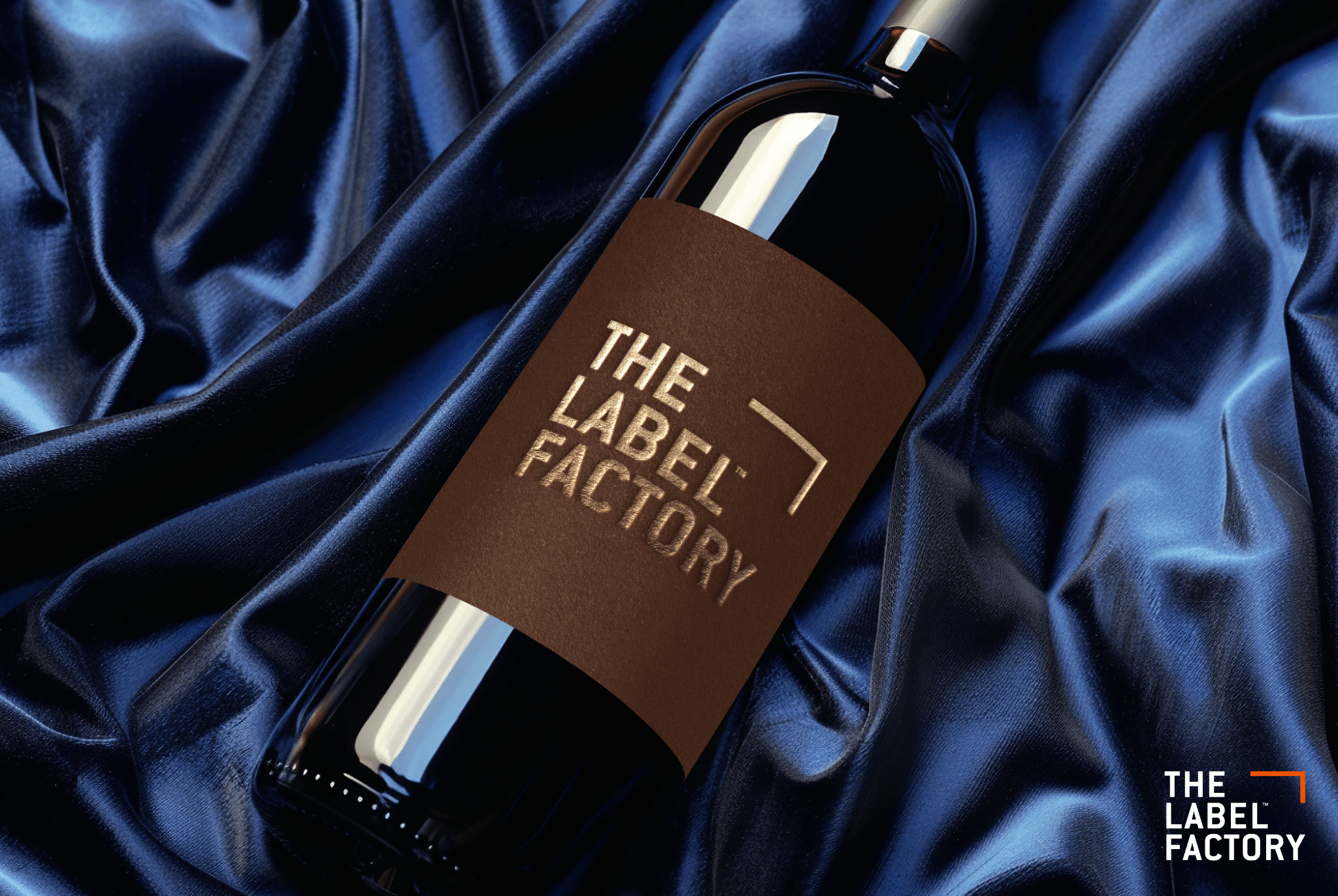
Embossing
Subtle yet effective, embossing can be applied to specific graphics or text to draw attention to certain details. Embossing involves impressing design elements from the underside of the label sticker, enabling them to become raised on the outer surface. With a slightly textured finish, it can help to build the impression of a higher quality product.
Foiling
Foil printing or stamping is a technique that uses heat and pressure to bond a metallic film to the surface of a label. By applying this effect in moderation, you can give your food label a metallic glint that catches the light and captures attention. While gold, silver and bronze are most commonly used, some companies will offer less traditional colours that could help your product stand out.
Matte
At first thought, a glossy finish may seem appropriate for a more upmarket product, but when it comes to food items, matte is likely to be a better option. Going back to that original example once more, Cadbury uses a shiny, satin finish, while Lindt favours a more subdued and classic matte style. As gloss can suggest fast food or cheap prices, it will be best to use a matte finish for more premium products.
Food Label Printing Tips
It’s important to consider every aspect of how your label looks and feels. Everything from the type of printing stock used, the shape of the label and how it is applied to your product can affect market perception.
Quality Stock
To demonstrate the quality of your offering, you need to print your label sticker onto a durable material. When liaising with your label printing company, ensure you advise the properties of your food product. With this information, they will be able to recommend appropriate printing stocks that will resist potential staining, tearing, smudging, peeling and more. Once you know which materials will work best for your product, you can select a stock with a texture that complements your label design.
Custom Die-Cut
Instead of using a standard label shape, consider creating a food label that is uniquely customised to your product. With a custom die-cut, your label can be printed in any shape you like to demonstrate that your product is quite literally a cut above the rest. From expressing the value of your product, to helping it stand out on the shelf, there is a lot to be gained from using a custom die-cut.
Direct Digital Printing
Rather than printing your label onto cardboard or plastic packaging, you may be able to print your design directly onto the bottle, jar or container. Keeping with the minimalism theme, direct digital printing will enable you to further simplify the look of your product and suggest a higher level of quality. Alternatively, you could create a food label sticker with a transparent background to achieve a similar effect.
Contact The Label Factory
If you’re looking to design a food label for a premium product, get in contact with the friendly experts at The Label Factory. We can help you select the most suitable printing finish and stock for your label sticker, ensuring you achieve an excellent outcome. Get in touch with us today.