Product stickers have the potential to be a powerful marketing tool that could significantly impact the success of your sales. With so much responsibility riding on your sticker design, it’s very important to get it right.
As it’s likely that your product will sit on a crowded shelf surrounded by its competitors, you need to give your product an edge to help it stand out and attract the attention of your target market. It all starts with designing a sticker label that’s appealing, appropriate and memorable.
You will also need to ensure that your product label is consistent with your brand and your offering. It needs to clearly communicate who you are and what you provide, while also including relevant information such as ingredients, serving sizes, instructions and more.
But it’s not enough to simply engage and inform your customers. To be truly effective, you need to think about how your product will be used in the long term. Your sticker design must be fit for purpose in order to build a positive experience and encourage customers to continually choose your product in the future.
There’s a lot to think about when creating custom stickers for your product, but if you take these five design tips into consideration, you’ll be able to achieve a desirable result.
Tip #1 Do Your Research
If you’re going to differentiate your product from other alternatives in the market, it pays to know what your competitors doing. Have a look at the sticker labels used by other brands and identify the similarities between them as this will help you find ways to make your product distinctive.
While being unique is a good thing, you also don’t want to be different simply for the sake of it. When brainstorming how to set your product apart, you also need to factor in your target market and what will appeal to them. By undertaking market research, you’ll be able to better understand your customers so that you can tailor your sticker design to them.
Tip #2 Think About Your Product
Before you begin to craft your design, you need to figure out whether you have any creative restrictions that you may need to work around.
Take a moment and think about every aspect of your product. What is it made from? What shape is it? How will it be used? Each of these factors could affect the sticker printing process and what you can and cannot do in your design.
Whether you’re looking to use a graphic designer or your own artistic skills, it’s best to first run your requirements by a sticker printing company. You may discover that certain colours won’t pop on the sticker material you require for your product. Perhaps gold foiling won’t be an option for you, but maybe you’ll be able to use a stock with a metallic sheen instead.
It’s good to know all this information before you start the design process to ensure you don’t waste your time and money. You don’t want to get your heart set on a concept that may not even be feasible. Learn more about common sticker printing mistakes here: Common Printing Mistakes To Avoid.
A professional will be able to recommend the most suitable printing stocks, techniques and finishes for your product and may even suggest some creative alternatives that you can add to your ideas pool.
Tip #3 Colour Combinations
Once you’ve clarified what’s possible and what options are available to you, you can start to put together the elements of your design and decide how you will use colour.
There is a lot of psychology behind how colour can inspire certain emotional responses. Colour can also lead the eye and draw attention to specific details, so it must be used carefully.
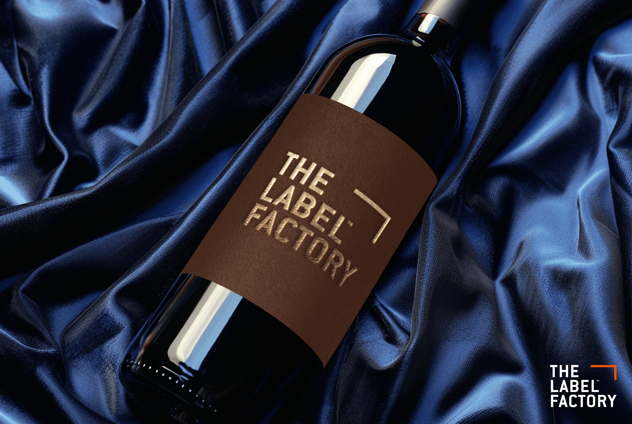
You could use contrasting colours or complementary shades depending on the look you want to create. For instance, if you’re looking to label a wine bottle, you could use a lightly coloured background so that your sticker contrasts against the dark tones of the bottle.
When deciding on the best colour combination, you also need to think about your brand as well as the properties of your product. While you should be using the colours associated with your logo, you should also consider the values and qualities of your entire brand identity when selecting the colours for your sticker. If it’s important for customers to know that you use eco-friendly practices, you may want to incorporate greens, blues and natural textures.
The colours used in your stickers should also be relevant to the product itself. For example, if you have a berry scented body wash, shades of pink and purple will be suitable. You also want to include colours that will be appealing when paired with your product. As black and grey are believed to be appetite suppressants, it may be a good idea to avoid overusing these shades on food products.
Tip #4 Fitting Fonts
You need to pair your colour scheme with the right typography, while ensuring that all of your text contrasts with the background colour for readability. Both the style and size of the font on your product label must be legible, while also reflecting your brand and your product.
Large, bold fonts may be a good option for products that need to demonstrate durability, as opposed to decorative, feminine styles that may be appropriate for beauty treatments. To give your product a unique appearance, you should avoid using generic or well-recognised fonts.
It’s best to only use 1-2 font styles on your product sticker. As you have a limited amount of space to work with, too many font types could become overwhelming. If you use one style for headlines and key details and another for supporting information, customers will be able to read your product sticker with ease.
Tip #5 Remember: Less Is More
Keep it simple. Your sticker design needs to be clean and clutter-free to be able to effectively communicate your messaging.
There will always be necessary information that must be present on your product, and then there will be important details that you would ideally like to include. To help you structure your label and ensure you don’t overload it with text, try creating an information hierarchy. It will enable you to decide what is essential and what needs to be given greater prominence.
What’s more, never underestimate the power of white space. Sometimes the periodic absence of colours, shapes and lines can strengthen the other elements in your design.
If you’re looking for further design advice and recommendations, contact The Label Factory today. We’re Perth’s product sticker professionals and can assist you with all your printing needs.